 English
 Portuguese
 Bahasa
Melayu
Bahasa
Melayu ไทย
ไทย 中文
中文 Tiếng Việt
 Español
 हिन्दी
 日本語
日本語 العربية
A forex chart is not a prediction machine. It is a live record of where buyers and sellers agreed, disagreed, and changed their minds. Learning how to read forex charts: candles, trends and key levels gives you a practical way to turn that record into a clearer trading plan instead of reacting to every price move.
For newer traders, charts can look crowded with colors, indicators, and conflicting signals. Start simpler. Read the price first, then use tools only when they add a specific layer of confirmation. This approach works whether you trade major currency pairs on a short-term chart or build positions from higher time frames.
Start With the Chart Basics
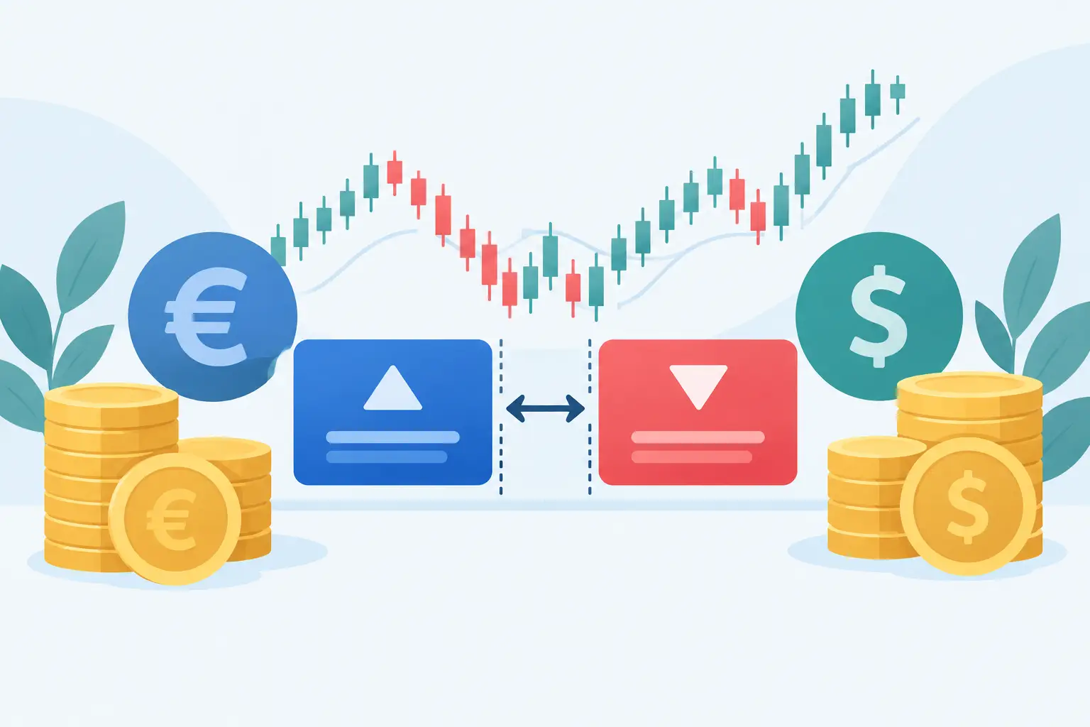
Every forex chart displays the exchange rate between two currencies. In EUR/USD, for example, the euro is the base currency and the US dollar is the quote currency. If EUR/USD rises, the euro is gaining value against the dollar. If it falls, the dollar is gaining value against the euro.
Before interpreting price action, make sure you know the time frame you are viewing. A five-minute chart can show a sharp intraday move that barely registers on a daily chart. Neither view is wrong, but they answer different questions. Shorter time frames are useful for timing entries and managing active trades. Higher time frames provide the broader market structure and often carry more weight.
A useful routine is to begin on the daily or four-hour chart, identify the market direction and major levels, then move down to the one-hour or lower time frame only if it fits your strategy. This prevents a small burst of volatility from convincing you that the larger trend has changed.
Read Forex Candles Before Adding Indicators
Candlestick charts are popular because each candle shows a complete price story for a selected period. Whether that period is one minute, one hour, or one day, every candle contains four prices: the open, high, low, and close.
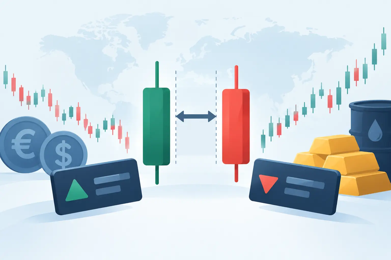
The body shows the distance between the opening and closing prices. A bullish candle usually closes above its open, while a bearish candle closes below its open. The thin lines above and below the body are called wicks, or shadows. They show the highest and lowest prices reached during that period.
A long bullish body suggests buyers controlled much of the session. A long bearish body suggests stronger selling pressure. But a single candle is rarely enough to support a trade decision. The location of the candle matters more than its color.
For example, a bullish candle that forms after price rejects a well-tested support zone may signal that buyers are defending that area. The same bullish candle appearing directly below major resistance may simply reflect a temporary bounce before sellers return.
What Candle Wicks Can Tell You
Long wicks often reveal rejection. If a candle pushes above a prior high but closes well below it, the upper wick suggests buyers could not maintain control at higher prices. If that happens at a known resistance level, it can be a warning that the breakout lacks conviction.
Likewise, a long lower wick near support can show that sellers drove price down but buyers stepped in before the close. This does not guarantee a reversal. It tells you that the level attracted a response, which is a reason to watch the next few candles closely.
Small-bodied candles, including doji-like formations, show hesitation. In a quiet market, they may mean very little. After a strong run into a major level, they can indicate that momentum is slowing and the next move needs confirmation.
Use Candle Context, Not Memorized Patterns
Traders often memorize names such as engulfing candles, pin bars, and inside bars. These patterns can be useful, but they are not automatic buy or sell signals. A bearish engulfing pattern in the middle of a broad uptrend may lead only to a minor pullback. The same pattern at weekly resistance, following an extended rally, deserves more attention.
The practical question is always the same: what is price doing at this location, and does the next candle confirm the idea? Waiting for confirmation can mean entering later, but it may reduce the number of weak, impulsive trades.
Identify the Trend Through Market Structure
A trend is more than a line sloping up or down. It is a sequence of highs and lows that shows which side of the market has control.
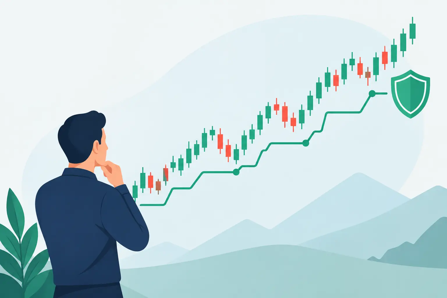
An uptrend typically produces higher highs and higher lows. Price pushes upward, pulls back without breaking the prior meaningful low, then pushes higher again. A downtrend produces lower lows and lower highs. In a range, price moves between an established ceiling and floor without creating a consistent sequence in either direction.
Mark the obvious swing points rather than every minor movement. If you have to force a trendline through several candles, it probably is not giving you useful information. Clean market structure is easier to see on higher time frames, which is another reason to start there.
Trade With the Trend, but Respect Its Stage
Trading in the direction of the prevailing trend can put market momentum on your side. In an uptrend, many traders look for pullbacks into support and then seek bullish confirmation. In a downtrend, they may watch for rallies into resistance and bearish confirmation.
That said, not every trend is equally tradable. Entering after several large candles have already moved in one direction can expose you to a pullback. A trend may be intact, but the entry can still be poor. It depends on your stop distance, the next key level, and whether the potential reward justifies the risk.
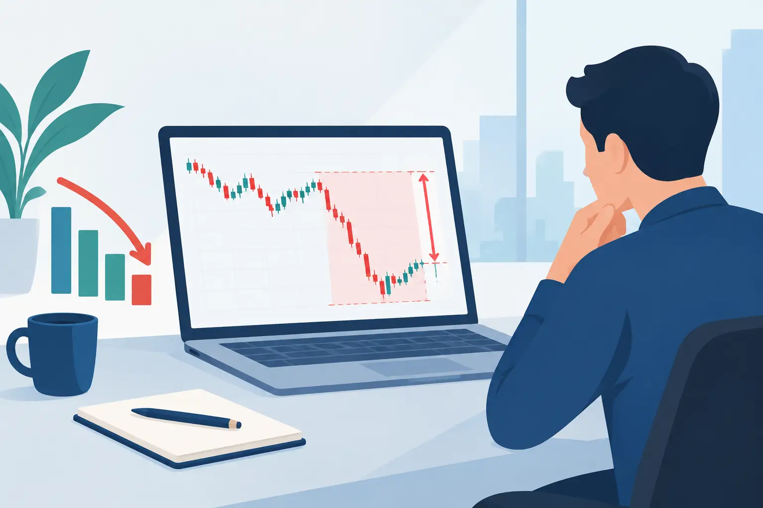
A structural break can also signal that conditions are changing. In an uptrend, a decisive move below the most recent higher low may show that buyers are losing control. Treat it as a reason to reassess, not as proof that a full reversal is guaranteed.
Mark Key Support and Resistance Levels
Key levels are price areas where the market has reacted before. Support is an area where falling price has found buying interest. Resistance is an area where rising price has met selling pressure. These are zones, not exact single-price lines.
Draw levels around obvious swing highs and lows, areas where price paused before a strong move, and points that have been tested repeatedly. Round numbers can also attract attention in forex markets, especially on widely traded pairs. The more clearly a level stands out on a higher time frame, the more meaningful it may be.
Avoid filling the chart with dozens of lines. Too many levels create indecision and make almost any trade appear justified. Focus on the areas closest to current price and the levels that have produced clear reactions.
Watch How Price Behaves at a Level
Price can bounce from a level, break through it, or break it and then return to test it. A breakout alone is not always enough. Look for a close beyond the zone and evidence that price can hold there. A move above resistance that quickly falls back below it is a failed breakout, often a sign of trapped buyers.
When old resistance becomes support after a confirmed break, traders sometimes call it a role reversal. The reverse can occur when broken support becomes resistance. These setups are useful because they combine market structure with a specific location for planning risk.
Build a Simple Chart-Reading Process
A reliable process matters more than finding a perfect pattern. Before opening a position, answer a short set of questions in order:
- What is the higher-time-frame structure: uptrend, downtrend, or range?
- Where are the nearest meaningful support and resistance zones?
- Is price currently at a level, or am I entering in the middle of a move?
- What do the current candles show about momentum or rejection?
- Where would the trade idea be invalidated, and is the potential reward worth the risk?
This sequence helps separate analysis from execution. For instance, if GBP/USD is trending higher on the four-hour chart and pulling back toward prior support, you might wait for a bullish rejection candle on the one-hour chart. Your stop would sit beyond the area that invalidates the support idea, not at an arbitrary number of pips.
The same framework also tells you when not to trade. If price is in the middle of a choppy range, sitting between key levels, and producing small mixed candles, there may be no clear advantage. Patience is a trading decision.
Keep Risk in the Picture
Chart reading improves decision-making, but it cannot remove uncertainty. Forex prices can move quickly around central bank decisions, inflation data, employment releases, and unexpected geopolitical events. Spreads and volatility can widen, and leveraged products can magnify both gains and losses.
Set position size based on your stop-loss distance and the amount you are prepared to risk, rather than choosing a trade size first and hoping the chart works out. Use a stop-loss where your analysis is invalidated, and avoid moving it farther simply because price is moving against you.
Platforms such as MT4, MT5, and cTrader make it easier to switch time frames, draw levels, and monitor open positions, but the platform is only the workspace. The edge comes from applying the same disciplined process each time.
The next time you open a chart, resist the urge to find a trade immediately. Mark the structure, identify the nearby levels, and let the candles show whether buyers or sellers are actually responding. Clear charts and controlled risk will take you further than a screen full of signals.